Monday, 15 December 2014
Sunday, 14 December 2014
Saturday, 13 December 2014
Main Article (Draft)
Janakan
‘Jana’ Loganathan (born 15 October 1997), better known by his stage name
Janakan, is an French/English rapper from Paris, France and raised in Harrow,
North West London since the age of 8. He became a fan of independent music
since Tupac Shakur’s hit song ‘Dear Mama’ which made Tupac his inspirational
idol. He is also a fan of cars and calls himself a ‘Car Enthusiast’. Janakan
speaks several languages including English, French and Tamil. He describes
himself as passionate about fashion, purchasing designer wear from Versace,
Gucci, Fendi and Louis Vuitton.
According
to Janakan, the rappers Tupac Shakur, Nas, Snoop Dogg, The Notorious B.I.G, 50
Cent and the Wu-Tang Clan were among the hip hop artists that he listened to
while growing up. He also considers himself a general music lover, and is an
admirer of the work of English R&B singers Amy Winehouse and Adele. On the
topic of his music genre, Janakan has said: “You really can’t categorize my
music, its human music.” Janakan’s music often features multisyllabic patterns,
poetic rhyme structures, intense storytelling, as well as rapid and melodic
deliveries. Janakan eventually took a gap year between his A-level and his
University. He returned later to study at Sixth Form and received an A* in AS
Media Studies, A in AS/A2 Music, B in AS/A2 ICT and B in AS/A2 Art. After his
qualifications, he decided to go Univeristy College of London, better known as
UCL which is ranked top 15th university around the United Kingdom. Studies
really worked out for Janakan’s success as he was working while producing
albums, mixtapes and singles for his fans. He had to balance his career with
his music which wasn’t impressive until when he decided to plan his daily
routine with the help of his school friends Jack and Muhammad.
Janakan
is mainly into underground and Hip-Hop/Rap music and this made him fix his mind
through his idol artist Tupac Shakur. He is part of one of the UK’s most
popular underground rap crews ‘A-Team’. Janakan and his crews started off as a
small gang in the North West London, they were involved in many activities
during their rise to stardom. Janakan has numerous mix tapes, including
#iAintPerfect 1 and iAintPerfect 2 featuring artists from all over the UK and
Blue Cheese which featured N-Dubz. His first mixtape #iAintPerfect was an
underground success. #iAintPerfect was given away for free on various online
outlets. His mixtape, Blue Cheese have supposedly sold more than 10,000 unites.
This success helped his popularity expand outside London. Having gained
considerable critical acclaim within the UK rap scene, he has recently signed
with Coke Boys Records. Janakan was given the chance to do a Fire in the Booth
by Charlie Sloth, which helped Janakan progress in his career. He has hit over
1 million views on YouTube which gave him the energy to contribute with BBC
1Xtra, BBC Asian Network, Capital FM and Radio 4.
Although
just being signed to Coke Boys Record, Janakan was in the process of releasing
the most anticipated “iAintPerfect 2”. He released visuals for ‘Trust Nobody’
& ‘Hometown’ which were instant hits on YouTube ranking up thousands of
views within days. He also released a video for ‘London Boy American Dreaming’,
featuring Brixton’s realist DVS. With Janakan very much in the promotion stage
for his anticipated mixtape, it was stopped abruptly as he was sent to America
to perform at French Montana’s album launch ‘Coke Boys’. This meant
‘iAintPerfect 2’ was released with very little promotion due to Janakan’s
absence.
Furthermore,
Janakan has been offered a sign up deal with the multi-millionaire artist
Jay-Z’s company, ROC Nation which he has agreed with the deal to release his
upcoming album ‘London Boy’ featuring artist all over London to give others a
chance to express their talents to the world. Once his album was released, he
gained a high amount of profit which he decided to use it for his next project,
however, he also decided to purchase a car that is suitable for summer where he
can use it for his next visual video shoot. For his video shoot which hit
hundred million views, he used sports cars from all over the country and used
it in his video as he is a passionate of cars since the age of 4. This made his
fans turn into a car enthusiast just like him.
Additionally,
mentioned previously, he is the leader of A-Team, alongside his brothers Gunna
Dee, Joe Grind, Spender, Young Giggs (YG), Kyze and Tiny Boost. The group’s
main producers are Boom Productions (aka BoomBlast), Universe, Pablo
Productions, Paws Production s, Bayoz Musik and Simple. In 2011, Janakan
appeared in Channel 4 TV drama Top Boy and Waterloo Road. He also featured in
the comedy film Anuvahood in the same year. Two years later, in 2013, Janakan
released the album ‘London Boy’ which sold thousands of copies across the
country and on iTunes. The album featured artists such as K Koke, Dappy, DVS, P
Money, Giggs, Sneakbo, English Frank, Don Jaga, Squingy, Meek Mill, French
Montana and lots more.
Janakan
has won 2 awards and was nominated for 2 other awards which were won by other
artists. Janakan has been nominated by the American Music Award for the “Sprint
New Artist of the Year” in 2011, he won the award of “Best New Artist” in 2011,
and he won the “Top New Artist” in 2012 and was nominated for the “Top Rap
Artist” in the same year.
Alternatively,
Janakan planned to launch his awaiting hoodie clothing line “Stack Notes, Act
Broke” under Coke Boys Records and ROC Nation. His words were “I started this clothing line to ensure that my fans are close to me at
all time and create a close bond between the fans and myself. I want them to
feel special and also, I want to provide the goods in order to start my
business to earn enough revenue to launch my own record label company.” This shows how much work Janakan is putting in to be successful in life
and a lot of people are being inspired by him which gives his fans a create
example to succeed.
October
21, 2013, Janakan became a self-entrepreneur where he established a clothing
line under ‘Last Kings Inc.’ which is called “Disturbing London”, where he sold
over 5,000 outfits across the world in just a year. He won the highest revenue
of the year in 2013 by the London Clothing Line company which pushed Janakan to
retail tracksuits, beanie hats, jackets and lots more to expand his business
across the world with the help of Last Kings Inc. During the May of 2013,
Janakan and his business partner Last Kings Inc. raised £3000 for the CLIC
Sargent Charity to help the people in Sri Lanka (Tamils) who are suffering from
having no houses to live in.
Later in
2014, Janakan continued with his career as a roadie, backup dancer and MC for
alternative Hip-Hop group Rayners Underground, eventually branching off as a solo
artist. As time approached closely, Janakan then moved to a different theme
where most of Janakan’s songs revolved around the hardship and street life in
inner cities and other social problems. Janakan wanted to be independent once
in his life time where he flew to Dubai to settle down with his career and as a
self-entrepreneur. He put the career on one side and took two months break
where he was working on an exclusive album called ‘Keep Your Head Up’. Janakan
said, “I want this album to wake everyone up and keep their mind up whenever
they want to make a decision. This album will give you everything you need to
do in order to succeed with the decision you all be making when the time comes.
I promise you, I promise you folks that this album will wake you up from your
sleep and all succeed at once, I promise…” This repetitive phrase from Janakan
stood with his fans for a long period until when he decided to release the
album under the record label ‘Coke Boys Records’ with an album launch in
America with the help of his record label partner French Montana. The album was
charted the #1 in iTunes and has sold over 4,000 copies across the UK.
Janakan is a big fan of independent music and
ensures that everyone who wants to show their talent to the world has to have a
platform with audiences supporting them in order to have a successful career.
He is currently in the middle of signing up young talented artists across the
UK to create a special platform for them where they all get a chance to show
the world what they have become using the microphone and a computer screen to
produce independent music. Janakan said, “If
you have the determination to succeed then, work for it and don’t take the
negativity personally. It’s your life, your dream, your success. Don’t let
nobody bring you down by just a negative comment. Use it to improve yourself
and come with something which can blow up peoples’ mind because nothing is
impossible when you put in your work into it!” His
words truly changed his fans who are always locked in with his latest songs and
news updates. His words are very inspirational to the teenagers and adults and
this is why he was ranked as the #1 UK artist across London in 2014. We, as
members of Rayners Magazine, wish Janakan a successful career in the future and
have a wonderful Christmas and a Happy New Year.
Friday, 12 December 2014
Proposal Draft
This is my draft proposal for my music magazine which will include everything I would need to make my magazine successful. My magazine will be based around the Hip-Hop/Rap genre as I grew up with those type of music at a very young age.
Monday, 1 December 2014
Production Log #15 - Music Magazine
Today, In my single lesson, I have started by finishing the indexes and adding the social networking sites above the band index. I also added a Q magazine cover to remind me of what to add at the top next to the 'Issue 1' heading. Next time, I will fill the black boxes with images of artists to ensure that I take similar shots to influence the readers to read my music magazine.
.jpg) |
| The progress of my music magazine |
Production Log #14 - Music Magazine
During this Media lesson, I have made the fonts the same using paragraphs. I have used a photo of a celebrity to give an idea on how my main image should look like in the final music magazine. I started placing the indexes so that it saves more time later on. For the index, I have used well-known music artists' name and wrote a short description about what the article will be about to make it easier for the readers to understand. In my next lesson, I will be finishing with the index and start putting social networking sites and add more images around the magazine to make it look like a bausy music magazine and also interesting.
.jpg) |
| The progress of the music magazine |
Thursday, 27 November 2014
Production Log #13 - Music Magazine
Today, I started the magazine layout by using three colours: Black, Red, Yellow and Turquoise but, it did not look good. So, I changed the layout again and made it look sharp by using Dark Red, Black, White and Dark Blue. After the changes, the magazine layout looked standard and I also used shadows on the main images to symbolize that those images are really important in the magazine contents page.
Next time, I am going to place the images of well-known artists on my magazine cotnents page so that I know how I want my photos to come out when it is my turn to take photos. I am going to think very carefully and decide how the images should come out by using existing photos from artists and I am also going to fill the band indexes with artists' name, a short description of the article and the page number next to it to let the audience know what page the article is in so they can find out more when they are on the page.
Next time, I am going to place the images of well-known artists on my magazine cotnents page so that I know how I want my photos to come out when it is my turn to take photos. I am going to think very carefully and decide how the images should come out by using existing photos from artists and I am also going to fill the band indexes with artists' name, a short description of the article and the page number next to it to let the audience know what page the article is in so they can find out more when they are on the page.
.png) |
| The progress of the music magazine |
Production Log #12 - Music Magazine
During my lesson in Media, I started to design my magazine contents page using a software called 'Adobe InDesign'.
Firstly, I began using three colours to give a rough idea on how the magazine will look like with the layout but I knew that the colours will be there temporarily because at the end of the lesson, I did not like the colour combination between, Red, Black, Yellow and Turquoise. The reason I chose those three colours are because the boxes in red represents the headings, the black boxes represents the images which I have taken over the half term, the boxes in yellow are the page numbers to make it esier for the audience to know where the image and the bright description of the artists will be and the boxes in turquoise represents the band index which means the headings of the pages along with the page numbers next to it to help the audience to go to the page they are interested in.
I made the font for the title (contents page) in bold and in white to make it look plain and simple so it can be understandable to the audience on what the page is about. The whole process will be designed on Adobe InDesign because it is a software which has all the features to create a music magazine and it is easy to use as I have used it previously to design other magazines.
Next time, I am going to change the colours of the boxes, change the page numbers, improve the title and label all the boxes with what I'm going to put in there as this will help me in advance on what to do to complete my contents page.
.jpg) |
| The starter of the music magazine |
Sunday, 2 November 2014
Audiences - Uses and Gratifications
Here is my Uses and Gratifications of an Audience. I have mentioned the explanation of what each audiences would say about the uses and the gratifications of a magazine and how they are used in order to sell the magazines. By completing this task, it will help me in designing my own magazine in the future and by doing this, I would exactly know what to use in order to find out how the audiences will use the magazine.
Wednesday, 15 October 2014
Audience Data (Survey Results)
This is the survey results where I go through the responds the audiences has given me when I created the survey. This survey will definitely help me when I design my music magazine.
Production Log #11 - Representation of the Magazines
During my Media lesson, I used a website called 'Prezi' and made a representation of the magazines and as I used it for the second time, I found it easier to use it and I covered things which includes: the representation of Hip-Hop/Rap Music Magazine, what is Hip-Hop?, examples of Hip-Hop/Rap artists, information about Hip-Hop/Rap artists, Hip-Hop/Rap Fashion, information of the Hip-Hop/Rap Fashion, information about the Wireless Festival and a conclusion to sum up everything in one slide. In every slides, I used images to interest the audiences when they read the slides for information.

Representation of the Hip-Hop/Rap
This is my research on the representation of the Hip-Hop/Rap music genre. I have covered the most of the well-known celebrities associated with the music genre. I also, looked at the music festival, 'Wireless Festival' and mentioned what particular genre they play at the festival. I spoke about the fashions of the Hip-Hop/Rap artists and used images of artists with their outfits to show what kind of outfits they wear and also what kind of jewellery they wear (gold or silver). By doing this research, it will boost my ideas on what to put in my future music magazine and as I would now what to include such as the outfits the Hip-Hop/Rap artists wear and the latest albums/singles releases for music festivals in order to update the audiences/fans.
Tuesday, 14 October 2014
Production Log #10 - Codes and Conventions
During my lesson, I created a 'Prezi' on the Codes and Conventions for a magazine. By using Prezi, I covered a lot of things about the Codes and Convention of the Magazines, the front covers, the contents pages, double page spreads and also a conclusion to sum up everything in one slide. For this task, I used the a website called 'Prezi' and as it was a first time experience, I found it kind of difficult to use it but later on, I got in touch with the website and got used to it as I knew what I was doing.


By completing this task, it helped me to understand the Codes and Conventions of the magazines and also, it will be easier for me to design a magazine in the future with these ideas on my blog.
Codes and Conventions
Here is my Codes and Conventions of the magazines (Front covers, Contents pages, Double page spreads and conclusion). By completing this task, I would typically know what every magazines have in common. This research is more focused to music magazine and I believe that doing researches on Codes and Conventions, it will help me in future in designing my own magazine using the same tool and layers in order to make my magazine look like a professional one.
Production Log #9 - Music Article Research
In my Media Studies lesson, I completed the article analysis task which was given by my teacher in class. I did it with full explanation which are similar to my front cover and contents page analysis. I wanted to add as much details as possible to know how magazines attract their target audiences by researching. I chose three music articles from the internet and placed them in a PowerPoint so it looks presentable to others. The reason why I was given this task, is because then I can use these analysed work to help me think ahead about how to make my magazine as successful as the company's magazine and also, what features I would need in a magazine as well as how I want the whole magazine to be represented. In my next lesson, I am going to start using Prezi where I will be making a Code and Convention slide which can also help me in further if I want to create a magazine and think about how I can represent it well to others.
Article Research (Music Magazine Double Page Spread)
In this research task, I analysed three music articles from the same different magazines. Each magazines a lot of different colour scheme but laid it out differently to make it look interesting to the readers. Analyzing these music articles can help me in my final design as I will understand and know what to do when I get a task where I have to design a music article based on a well-known article and also, I would know what I would need in order to portray in the musical genre for my article in the future.
Sunday, 12 October 2014
Production Log #8 - Contents Page Research
In this Media Studies lesson, I analysed 3 contents page by using PowerPoint. I ensured that I completed this task in full details with backed up evidence. I am aware that this will help me in the future if I wanted to design a contents page for the school. By doing this task, it gave me inspirations as to what I want my contents page cover to look like in the end by thinking about the layout, color scheme, title and also the house style. The contents page which I really enjoyed working on was the Vibe's magazine with a female artist doing the V letter with her legs which looked unique and professional. If I had to design a contents page, I will definitely design it similar to the Vibe's magazine as they laid everything out perfectly with the right color scheme and also the right main image to attract their target audience.In my next lesson, I will start analyzing the double page article spread based in music artists for the magazines and I will also make sure that I analyse it in full details by giving evidences to back up my point.
Content Page Research (Music Magazine Covers)
In this research task, I analysed three contents page from the same music magazines 'Vibe'. Each magazines relates to the artists on the contents page and the color schemes are different even though they are all from the same music magazine company. Analyzing these contents page can help me in my final design as I will understand and know what to do in my contents page and also, I would know what I would need in order to portray in the musical genre for my magazine in the future.
Production Log #7 - Front Cover Research
During my Media lesson, I was given a task where I have to chose three existing music magazine covers. I analysed three music magazine covers: two from NME and one from XXL. Both of the magazines are completely different from main image to colors schemes and unique in its own way of publishing. By analyzing these three music magazine covers, I get a better understanding of what is in a magazine and get a clearly set of mind when I come across a task where I have to design my own music magazine cover. All three of the music magazines are commonly similar as they are all about music (artists). I personally thought that this task could help me get ideas on how my front cover page will look like with many company inspirations.
Firstly, I went on Google and looked up all the music magazine covers and chose three best magazines which I can talk about each parts and also put it as much details as possible to get the highest mark in my lessons. After choosing the three music magazine covers, I opened up PowerPoint and put each magazine covers in each slides so that I can talk about each parts in the music magazine covers in the individual slide.
Secondly, I looked up closely at the magazines and started with the main image. When looking at the main image, I discovered a lot of new things so I started to type what I noticed and how it attracts the readers to be influenced by the music artists. I then moved onto color scheme where I elaborated on how the colors which have been used in the music magazines seeks attentions to the readers and I also mentioned the colors the magazine companies have used which are all similar to one to the other. Futhermore, I began to state a paragraph on pull quote which is said by Lily Allen who is a well-known artist. I mentioned that the pull quote is a direct message from the artist their fans and reader who reads the magazines. At the end, I also talked about the sell lines which gives a small description about the artist in the main image. Additionally, I stated why the colors are used and what it symbolizes as it is a technique all the magazine companies use to attract the readers.
Thirdly, once I was finished with the front cover research, I came across a slide share website where I can embed the link onto my blog so it looks neat and clear. The website I used was 'slidshare.com' which is a website that creates a PowerPoint slide where people can flick through slides very quickly.
Firstly, I went on Google and looked up all the music magazine covers and chose three best magazines which I can talk about each parts and also put it as much details as possible to get the highest mark in my lessons. After choosing the three music magazine covers, I opened up PowerPoint and put each magazine covers in each slides so that I can talk about each parts in the music magazine covers in the individual slide.
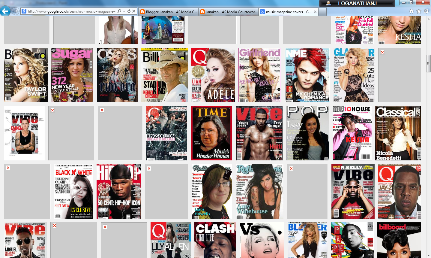 |
| Music Magazine Covers on Google |
| PowerPoint used to put in all the chosen magazines with the details |
Wednesday, 24 September 2014
Front Cover Research (Music Magazine Covers)
The task I was given is to look into existing music magazine covers. I analysed three music magazine covers: two from NME and one from XXL. Both of the magazines are completely different from main image to colors schemes and unique in its own way of publishing. All three of the three music magazines are common as they are all about music (artists). I personally think that this task can help me get ideas on how my front cover and my content page will look like with many company inspirations.
Monday, 22 September 2014
Production Log #5 - Uploading the Video onto YouTube
When I created a video by using 'CamStudio' and then used 'Adobe Premiere Pro CC' to edit it so it looks professional when people watch it. I wanted to upload the video onto YouTube because then it would give me the highest quality which is 1080p and also it will be easier for people to watch it as everyone use YouTube to watch a clip.
I started up by going on YouTube.

YouTube suggested me to sign in if I wanted to upload a video into my channel. So, I signed in and then clicked 'Upload'. This enabled me to upload any videos that are in my desktop onto YouTube.

YouTube told me to select files to upload or to drag and drop video files. So, I clicked the upload button that's in red as it will be easier for me to find the video.

When clicking the upload button, I selected the video I wanted to upload onto YouTube.

After selecting the video, I clicked 'Open'.

By clicking 'Open', it immediately started the uploading process. As you can see in the picture below, I have circled to show that it is uploading onto YouTube.

When the uploading process was completed, I clicked 'Publish' as this will let the public watch my video.
I started up by going on YouTube.
YouTube suggested me to sign in if I wanted to upload a video into my channel. So, I signed in and then clicked 'Upload'. This enabled me to upload any videos that are in my desktop onto YouTube.
YouTube told me to select files to upload or to drag and drop video files. So, I clicked the upload button that's in red as it will be easier for me to find the video.
When clicking the upload button, I selected the video I wanted to upload onto YouTube.
After selecting the video, I clicked 'Open'.
By clicking 'Open', it immediately started the uploading process. As you can see in the picture below, I have circled to show that it is uploading onto YouTube.
When the uploading process was completed, I clicked 'Publish' as this will let the public watch my video.
Production Log #4 - Using Adobe Premiere To Render The Video
After recording the video of how the school magazine is designed, I wanted to edit the video so that I can add a song in the background as this will not bore the people who watch it and also, cut the bits where it's irrelevant to what I was doing.


When I was satisfied with the selection by selecting 'School Magazine Video', I clicked 'Open' and it extracted the video into 'Premiere Pro CS6'.
To edit the video, I opened up 'Adobe Premiere Pro CS6'.
Once 'Adobe Premiere Pro CS6' opened, I clicked on 'New Project'. This will make a new layer where I can cut and edit the bits I don't want people to see when they watch the video on YouTube.
I wanted to import the video I recorded into Premiere Pro CC. So, I clicked 'File' and then clicked 'Import' where this will let all the files appear and choose which one to import.
When I was satisfied with the selection by selecting 'School Magazine Video', I clicked 'Open' and it extracted the video into 'Premiere Pro CS6'.
Even though, the video was on the layer, I had to drag the clip onto the editing track where I'll be able to make changes such as: cutting sections of the video, creating an introduction video at the start, add musics in the background and lots more.
Preliminary Task - Evaluation
 In my preliminary task, I'm going to evaluate my front cover and my content
page, which were designed in Adobe Photoshop CS6 for the Haydon School. For my
front cover, I chose two colours for the title because both of the colours
represents the Haydon School and the colours are purple and white. The font I
have used for the title is called 'Bernard MT Condensed' which is a bold and
simple font which attracts the students' attention from a far distance.
However, the texts around the title has a complete different font as I wanted
the magazine to look lively and interesting instead of being dull and plain.
Furthermore, I added clip arts of everything that is related to Haydon School,
for example: dictionary, thesaurus, books, bags and the students' accessories.
The main image of the front cover is a student at Haydon School who achieved
excellent GCSE grades and the reason why I chose to put a picture of a student
is because I wanted the students to be inspired and look up by the student
who's on the magazine. Furthermore, the texts around the title are spread all
over the front page so that the students have an idea of what the magazine is
about and also can focus on the front page too. In the background, I added a
picture of the cloud to give the magazine a nature feeling and a picture of the
school building behind the title to make the font stand out. At the bottom of
the front cover, I added the school website so that the students know where to
go to find out more about a topic that's in the magazine.
In my preliminary task, I'm going to evaluate my front cover and my content
page, which were designed in Adobe Photoshop CS6 for the Haydon School. For my
front cover, I chose two colours for the title because both of the colours
represents the Haydon School and the colours are purple and white. The font I
have used for the title is called 'Bernard MT Condensed' which is a bold and
simple font which attracts the students' attention from a far distance.
However, the texts around the title has a complete different font as I wanted
the magazine to look lively and interesting instead of being dull and plain.
Furthermore, I added clip arts of everything that is related to Haydon School,
for example: dictionary, thesaurus, books, bags and the students' accessories.
The main image of the front cover is a student at Haydon School who achieved
excellent GCSE grades and the reason why I chose to put a picture of a student
is because I wanted the students to be inspired and look up by the student
who's on the magazine. Furthermore, the texts around the title are spread all
over the front page so that the students have an idea of what the magazine is
about and also can focus on the front page too. In the background, I added a
picture of the cloud to give the magazine a nature feeling and a picture of the
school building behind the title to make the font stand out. At the bottom of
the front cover, I added the school website so that the students know where to
go to find out more about a topic that's in the magazine.In my content page, I added an image of the same cloud that's been used in the front cover to show the students that both of them are in the same magazine. At the top of the page, I added the title too so that the students know what the page is really about. Each of the pages' name has a number on the left to guide the students where each pages are. The title is in two colours (Blue and Black) and the reason why I chose those two colours is because they both stood out when I was looking at the title from a far distance. The names and the numbers of the pages are in multi-colours which in other words, it is coded so that the students get a clear understanding of where each pages are and also, I used different colours to attract the students because normally, students are more into colourful pages than plain pages.
The positive thing about my magazine is that I have put in so much effort in it as it was a task given by my Media teacher. The strength about my magazine is that I made the front cover colourful and lively with so much clip arts around the title and texts all over the page. I personally think that I have met the criteria for the preliminary task and have successfully succeeded the task by designing a school magazine for Haydon School. However, I could have improved my front cover by having a school slogan somewhere in the page so that it could influence the students, add more texts at the bottom of the title and make the title bold. I also could have improved the content page by adding social networking sites like: Facebook and Twitter and add special messages of the seniors to influence the students in school.
I will make sure that when I come across a task like this in future, I use the new skills that I have been taught by the experts for my actual task and also make sure that my magazine looks simple but professional when it comes to presenting to the students.
 |
| Progess of making the front cover for the School Magazine |
 |
| Final look of the front cover for the School Magazine |
 |
| Progress of making the contents page for the School Magazine |
 |
| Final look of the contents page for the School Magazine |


Sunday, 21 September 2014
Saturday, 20 September 2014
Production Log #3 - Creating A Video Using CamStudio
To create a video to show how I designed the School Magazine, I had to use 'CamStudio' which is a software that records everything that's on the screen.


Once I clicked 'Save', this video properties window popped up. I didn't make any changes because it seemed fine to me so I pressed 'OK'.

By clicking 'OK', it saved the video on my desktop as a window player file.

To make the software record the screen, I clicked on the red circle and it began to record what I was doing which in this case, showing how I designed the School Magazine.
When I was finished with recording, I then clicked on the blue square which is the pause button and it asked me where I wanted it save it, so I selected 'Desktop' and clicked 'Save'.
Once I clicked 'Save', this video properties window popped up. I didn't make any changes because it seemed fine to me so I pressed 'OK'.
By clicking 'OK', it saved the video on my desktop as a window player file.
Production Log #2 - Producing My Preliminary Task
In school, I
completed my preliminary task, which was to design a front cover and content page
of the school’s magazine. The software I used to design the school magazine was
‘Adobe Photoshop CS6’ and I opened up my document as I continued to edit the
front cover. On the front cover, I made changes which include changing the name
of the magazine to ‘School Magazine’. I decided this to be the name of the
magazine as it is easy to recognize when the students see the magazine and also
it is suitable for the theme and genre of the magazine. I used a purple colour
text to represent the Haydon School and white to represent the students’ shirt.
I placed the ‘Haydon Magazine’ text in the middle as students normally look in
the middle when they see a magazine. I continued with my front cover in my
media lessons by adding texts around the title like: ‘Results Day’, ‘Comedy
Night!’ and also add photos of everything the school provides and what the
students bring to school, for example: dictionary, thesaurus, healthy foods,
bags, books and all the accessories. All the clip arts around the title are
linked with Haydon School. Adding the clip arts around the title took me quite
a long time because I had to think where it would look better and also, I came
across an issue which was taking up my time as all the layers were all over the
place and I had to put them in order so that it will be easier for me to edit
it again when I come back to improve it. Some of the texts have an image so
that the front cover looks lively and interesting and more focused on the news that’s
added on the magazine. When it came to picking a main image of a student, I
couldn’t think of a pose to give them as I wanted the image to be placed in the
middle, above the magazine text so I’m going to leave it without a main picture
for now and come back when I have chosen the pose to give to the student.
After putting the front cover onto one side, I started with the content page and for that, I used the same software I used when I designed the front cover. I placed the title of the content page at the top of the page but in the middle so it look professional. Next to the title, I added the Haydon School logo to symbolize that the magazine is published by the Haydon School. I decided that the content text should be in blue and the page text should be in black. The reason why I chose both colours is because it stood out when I was looking at it from a far distance. The names and the numbers of the pages were lined underneath the content page title with multi-colours (red, purple, blue, turquoise, turquoise/green, green and light green). Beneath the names and the numbers of the pages, I added three photos of the Haydon School to show how it looks from the outside. This task took me time as I had to look at different photos of the school and decide which one would best suit the content page.
.png)
I really enjoyed
designing the front cover and the content page but it was worrying me that I
couldn’t think of a pose to give to the student so it would suit the front
cover but, I’m happy that I finished it in a double lesson with a bit of
difficulties in making the front cover and the content page look professional.
I’m also really confident in using the Adobe Photoshop CS6 and sonly hope that
I will be able to use it in my next future task.
Tuesday, 16 September 2014
Production Log #1 - Preliminary Task
For the preliminary task, I was told to design a school magazine for Haydon School where all the news from school will be in pages including the front cover and the content page. When I was told about the task, I had a rough idea on my mind of how it is going to be which in this case, it is going to be colourful and related to school students. The magazine I am going to design will be targeted at the students who are aged 13-18 because that is the age all the students stay at school and when they become 18, they either go through the apprenticeship route or go university. I have decided that this school magazine has to grab the students' attention by using colourful texts and making the title bold so that the students can notice it from a far distance and will be keen to read it and not just put it in their bags and not see it ever again. In addition, I want the school magazine to be related to the school students like for example: after school activities, the statistic diagram of last year's GCSE/GCE results, pictures of the new buildings in school, the timetable of the meals the canteen distributes and other things around school. I also want this school magazine to be based on everything that is related or involved with the students in school for instance: the results day, new year 7s, the canteen and also the new buildings. After taking in all the ideas, I was then told to create a power point and put all my ideas in a spider diagram so that I could come back and change it if I am not satisfied with it, just before I upload the power point onto my blog. As I gathered and saved all my ideas on a power point with the following headings such as: front page, content page, colour scheme and news, my next task is to draw the front cover and the content page in much details as possible and colour them to make it look realistic.
 |
| The ideas I came up with for the school magazine. |
Subscribe to:
Posts (Atom)