Friday 22 May 2015
Sunday 10 May 2015
Final Magazine Evaluation
This is my Music Magazine Evaluation answering all 7 questions about the selected genre.
Wednesday 22 April 2015
Final Production Log
This is the Final Production Log where I recapped everything I have done since when I started his G321 Unit 1 coursework. I have given smal descriptions of each posts to make it simple to understand.
Audience Feedback
This is an audience feedback from Simon Cheshire who came across my music magazine, explaining the positive and the negative aspects of my media product. This is an audience feedback from Thivyan Kowridas who came across my music magazine, explaining the positive and the negative aspects of my media product.
Production Log #25
Even though my music magazine was up to standard, I wanted to make it better by makingnew changes like: changing the front cover image to my model who is wearing a black suit to represent the successfulness of his career in his music industry; changing the font of the masthead to make it look professional and bold; changing few feature artists images in my contents page to attract a wider audience and filling up the blank spaces in my main article so that it looks busy and attractive.
Tuesday 14 April 2015
Saturday 7 March 2015
Production Log #24
At home, I started doing my audience profile using Prezi, to make my presentation interesting. I used the featured artist of my music magazine and one of my friend to give examples on how much they spend for music magazines and items related to music and their interest in their specific artists. Next time, I am going to do my proposal feedback and my magazine feedback.
Audience Profile
This is my audience profile which explains the interest my target audiences are into and also, explains how much they spend on music magazines and the other things related to music.
Friday 20 February 2015
Drafts
This is the drafts of my music magazine, it shows exactly what I have been doing in order to design and complete a music magazine.
Sunday 15 February 2015
Wednesday 11 February 2015
Contents Ideas
In this PowerPoint, I have covered the main bits that i would be needing in my music magazine in order to encourage the readers to read and buy my magazine and also to make my music magazine look as professional as my competitors. I have included the contents page ideas, the social media sites , subscription and the reviews.
Monday 2 February 2015


Sunday 1 February 2015
Production Log #22 - Music Magazine
It was a day where we received the feedback from our Media teacher Mr Robsons and in my double lesson, I began to improve the contents page as it had the most negativity then any other pages in the music magazine. I realized that I did not have a front cover for the featured article so I started it by using the same file, add a new page and choose a suitable photo to fulfill the whole two pages. Before the end of the double lesson, I began to put a rough idea on what I need to improve on in order to amaze my teacher.
Thursday 29 January 2015
Props/Costume Ideas
This is a Prezi presentation which explains all of the props and costumers I will be using in my photoshoot in my music magazine and why I decided to use them for my magazine.
Wednesday 28 January 2015


Time Lapse (Behind the Scenes) - Photoshoot
This is my two minutes time lapse which is recorded to show how I took my photoshoots. I recorded this time lapse in my school studio room which contains of every equipments we all need to take a photoshoot. I have used a school camera called 'Canon 550D' which has a high-definition quality. Moreover, to make the photos professional, I used a white and black screen. This is to give an effect on the image itself when it comes to editing.
Tuesday 27 January 2015


Monday 26 January 2015
Equipment
I will also use Power Point, Word Documents and Prezi's a lot while planning my magazine and I will be using Slideshare a lot too, while embeding documents rom my computer files. Just because I have used these programs before, it made it easier for me to get the tasks done quickly and effectively, instead of wasting the time in trying to find out how to use different tools.
Camera and Lighting:
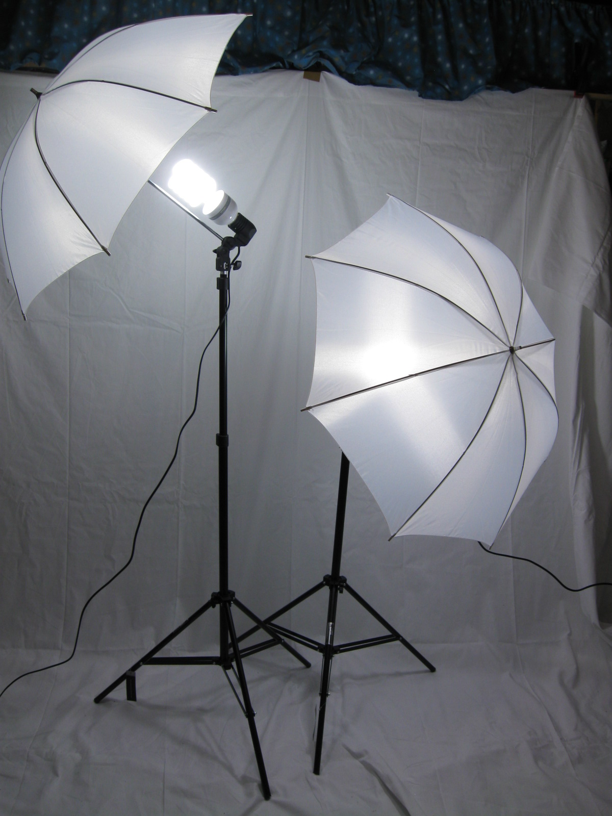 |
| Photoshoot Lights |
I used a Canon 550D SLR for my photoshoot as it captures high-definition and qualified pictures with no blurriness on the face. I wanted the images to be sharp as the magazine will simply not look as professional if the images are not clear enough. I have used a white screen which is very effective because it is clean and simple and just brings all the audiences', audience towards the article who is featured on the front cover of the music magazine. The white screen can be an advantage when it comes to editing as it will be easy to crop out the background when using the pen tool in Adobe Photoshop. The lights enabled me to change the way my images appeared and allowed me to create the best possible image by lightening the face as the audiences will mainly focus on it whenever they see a music magazine. By combining the lights, white screen and the SLR allowed me to create a high-definition image which can make my magazine look professional.
Computer Software:
I am currently using Adobe InDesign to make my music magazine, instead of using Adobe Photoshop as InDesign is a much more accurate and professional editing software twhen it comes to creating a qualified magazine. InDesign enables me to view the document as a magazine and can also use various of different tools such as the master page which quickly and effectively add the same text to all the pages. This is an advatnage because I don't have to spend a lot of time in putting the same thing in every single pages. This makes adding page numbers,websites and social networking links a lot more easier as it prompts to audience to use these links as they will be in every page.
| Adobe Photoshop. |
| Microsoft PowerPoint. |
| Microsoft Word. |
| Adobe InDesign. |
Colour Ideas

I have made various of colour schemes to use during my magazine. My favourite colours are the strong red (1st one) in the 4th field and the white (1st one) in the 1st field. I personally think that I like these two colours as they are extremely eye catching and also stands out. These colours relates to my music genre which is Hip-Hop/Rap. The colour white is associated with light, goodness, innocence, purity and cleanliness. As opposed to black, white usually has a positive connotation. Hip-Hop/Rap is about having light and goodness and being the best of the best so it links in well with a white colour. Dark red is associated with willpower, rage, anger, leadership, courage, longing, malice and wrath. I think it is very important that I use one more colour which can be black for my magazine because if not, I will have the risk of making the magazine 'Over The Top'. I do like the idea of having the text in white as it ties in nicely with the cover page and makes the headings stand out when the readers read the music magazine.
Monday 19 January 2015
Contact Sheet #1
These are the photos which I have captured using my Friend and Myself. I have captured these photos in order to use them in my music magazine contents page. I also captured over 40 photos as this will make me decide which photo to use when it comes to choosing the best photos.
Wednesday 7 January 2015
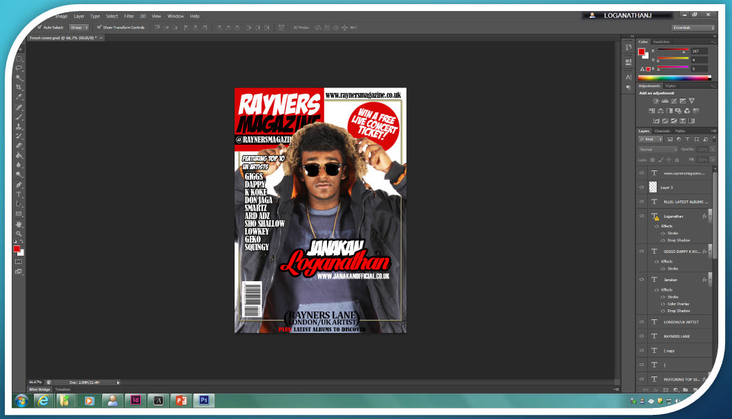
Production Log #21 - Music Magazine
I had
a double lesson but for the first half an hour, I cropped the photo I took from
the school studio and placed it in the middle of the music magazine front
cover. Afterwards, I added a sticky note saying “WIN A LIVE CONCERT TICKET!” to
encourage the readers to read my magazine
and added a red background to match the logo’s theme colour. Before finishing
the front cover, I copied a barcode to make the magazine look realistic and
placed it in a corner. At the bottom of the music magazine front cover, I wrote
‘Rayners Lane – London/UK Artists
Production Log #20 - Music Magazine
In my
single Media lesson, I continued with the front cover. I made few changes such
as: changing the font colours to white and adding a black outline to make it
stand out because black looked plain. I
also changed the text, ‘Janakan’ from blue to white to have a combination
between the front magazine cover and the rest of the magazine. The background
for ‘@RaynersMagazine’ was
blue and it did not suit my magazine theme colour which are white, black and
red so, I changed it to black. I wanted the front magazine cover to stick with
3 colours I also changed the background for ‘£1.50’. To have a lot of space for
my main image, I had to move the official ‘Rayners Magazine’ logo at the top
left-hand side and moved the magazine’s website to the side in black bold font.
 |
| The progress of my music magazine. |
Production Log #19 - Music Magazine
In my
Media lesson, I continued with the front cover just to make sure that it is
done on time. I added the ‘Rayners Lane and London/UK Artists’ heading at the
top to let the readers know that the artists featuring the Music Magazine are
based around Rayners Lane, London. I also added a text which says ‘featuring
top 10 UK artists’ in black and in capitals so it can be seen by the readers
very easily. I then added a barcode to make the magazine realistic and make the
readers think that they have officially bought it off a shop.
 |
| The progress of my music magazine. |
Production Log #18 - Music Magazine
As I
didn’t have Adobe InDesign at home, I had to use Adobe Photoshop CS6 in order
to do my Music Magazine front cover. I started the front cover by coming up
with an idea on how to impress the readers and decided to use a bright red
rectangle and write ‘Rayners Magazine’ on top of it. I also mentioned the
Twitter username and the Music Magazine price. Alternatively, I added the top
UK artists on the left-hand right in black and capital letters. Next to the UK
artists, I added the name of the artist who is going to be featuring as the
front cover. The frame is added to give a unique feeling to the readers and
also added a small message at the top to let the readers know about the latest
albums to discover.
 |
| The progress of my music magazine. |
Production Log #17 - Music Magazine
When
it came to placing my own photos on my music magazine contents page, I had to
remove a lot of bits such as the blue background on the magazine page titles so
that it matches the theme colours (white, black and red). I used high quality
photos for my contents page because I
wanted the contents page to look professional and understandable. At the bottom
of the contents page, I added key words of the magazine such as
‘#iAintPerfect’, ‘Business Entrepreneur’, ‘UK Artist’ and ‘London Boy American
Dreaming’. I added ‘Janakan Loganathan’ at the top of the main image (photo
number 15) to make the reader remind of who’s article they are about to read.
 |
| The progress of my music magazine. |
Production Log #16 - Music Magazine
In my
Media lesson, I started putting the photos I have taken over the half term into
the contents page. I also wrote a small description of the artist in photo 20
to make the readers more interested into the artists. Alternatively, I changed
the colour of the photo numbers to red so they stand out when people see the
information from a far distance. In my next lesson, I am going continue writing
the description of the artist in photo 20 to fill up the blue box and add
photos which I have taken to make the magazine look busy.
 |
| The progress of my music magazine. |
Tuesday 6 January 2015
Mastheads Designs (Music Magazine)
I have listed a few fonts which I think it suits my music magazine. I have decided that 'Badaboom BB' font is suitable as it looks bold and grabs the reader's mind when they look at something else in the magazine.
Mood Board - (Music Magazine)
This is the Mood Board which I have create that relates everything about Hip-hop/Rap music genre. These are the bits I would need in my final music magazine.
Subscribe to:
Posts (Atom)