Showing posts with label Production Log. Show all posts
Showing posts with label Production Log. Show all posts
Wednesday, 22 April 2015
Final Production Log
This is the Final Production Log where I recapped everything I have done since when I started his G321 Unit 1 coursework. I have given smal descriptions of each posts to make it simple to understand.
Production Log #25
Even though my music magazine was up to standard, I wanted to make it better by makingnew changes like: changing the front cover image to my model who is wearing a black suit to represent the successfulness of his career in his music industry; changing the font of the masthead to make it look professional and bold; changing few feature artists images in my contents page to attract a wider audience and filling up the blank spaces in my main article so that it looks busy and attractive.
Saturday, 7 March 2015
Production Log #24
At home, I started doing my audience profile using Prezi, to make my presentation interesting. I used the featured artist of my music magazine and one of my friend to give examples on how much they spend for music magazines and items related to music and their interest in their specific artists. Next time, I am going to do my proposal feedback and my magazine feedback.
Friday, 20 February 2015
Sunday, 1 February 2015
Production Log #22 - Music Magazine
It was a day where we received the feedback from our Media teacher Mr Robsons and in my double lesson, I began to improve the contents page as it had the most negativity then any other pages in the music magazine. I realized that I did not have a front cover for the featured article so I started it by using the same file, add a new page and choose a suitable photo to fulfill the whole two pages. Before the end of the double lesson, I began to put a rough idea on what I need to improve on in order to amaze my teacher.
Wednesday, 7 January 2015
Production Log #21 - Music Magazine
I had
a double lesson but for the first half an hour, I cropped the photo I took from
the school studio and placed it in the middle of the music magazine front
cover. Afterwards, I added a sticky note saying “WIN A LIVE CONCERT TICKET!” to
encourage the readers to read my magazine
and added a red background to match the logo’s theme colour. Before finishing
the front cover, I copied a barcode to make the magazine look realistic and
placed it in a corner. At the bottom of the music magazine front cover, I wrote
‘Rayners Lane – London/UK Artists

Production Log #20 - Music Magazine
In my
single Media lesson, I continued with the front cover. I made few changes such
as: changing the font colours to white and adding a black outline to make it
stand out because black looked plain. I
also changed the text, ‘Janakan’ from blue to white to have a combination
between the front magazine cover and the rest of the magazine. The background
for ‘@RaynersMagazine’ was
blue and it did not suit my magazine theme colour which are white, black and
red so, I changed it to black. I wanted the front magazine cover to stick with
3 colours I also changed the background for ‘£1.50’. To have a lot of space for
my main image, I had to move the official ‘Rayners Magazine’ logo at the top
left-hand side and moved the magazine’s website to the side in black bold font.
 |
| The progress of my music magazine. |
Production Log #19 - Music Magazine
In my
Media lesson, I continued with the front cover just to make sure that it is
done on time. I added the ‘Rayners Lane and London/UK Artists’ heading at the
top to let the readers know that the artists featuring the Music Magazine are
based around Rayners Lane, London. I also added a text which says ‘featuring
top 10 UK artists’ in black and in capitals so it can be seen by the readers
very easily. I then added a barcode to make the magazine realistic and make the
readers think that they have officially bought it off a shop.
 |
| The progress of my music magazine. |
Production Log #18 - Music Magazine
As I
didn’t have Adobe InDesign at home, I had to use Adobe Photoshop CS6 in order
to do my Music Magazine front cover. I started the front cover by coming up
with an idea on how to impress the readers and decided to use a bright red
rectangle and write ‘Rayners Magazine’ on top of it. I also mentioned the
Twitter username and the Music Magazine price. Alternatively, I added the top
UK artists on the left-hand right in black and capital letters. Next to the UK
artists, I added the name of the artist who is going to be featuring as the
front cover. The frame is added to give a unique feeling to the readers and
also added a small message at the top to let the readers know about the latest
albums to discover.
 |
| The progress of my music magazine. |
Production Log #17 - Music Magazine
When
it came to placing my own photos on my music magazine contents page, I had to
remove a lot of bits such as the blue background on the magazine page titles so
that it matches the theme colours (white, black and red). I used high quality
photos for my contents page because I
wanted the contents page to look professional and understandable. At the bottom
of the contents page, I added key words of the magazine such as
‘#iAintPerfect’, ‘Business Entrepreneur’, ‘UK Artist’ and ‘London Boy American
Dreaming’. I added ‘Janakan Loganathan’ at the top of the main image (photo
number 15) to make the reader remind of who’s article they are about to read.
 |
| The progress of my music magazine. |
Production Log #16 - Music Magazine
In my
Media lesson, I started putting the photos I have taken over the half term into
the contents page. I also wrote a small description of the artist in photo 20
to make the readers more interested into the artists. Alternatively, I changed
the colour of the photo numbers to red so they stand out when people see the
information from a far distance. In my next lesson, I am going continue writing
the description of the artist in photo 20 to fill up the blue box and add
photos which I have taken to make the magazine look busy.
 |
| The progress of my music magazine. |
Monday, 1 December 2014
Production Log #15 - Music Magazine
Today, In my single lesson, I have started by finishing the indexes and adding the social networking sites above the band index. I also added a Q magazine cover to remind me of what to add at the top next to the 'Issue 1' heading. Next time, I will fill the black boxes with images of artists to ensure that I take similar shots to influence the readers to read my music magazine.
.jpg) |
| The progress of my music magazine |
Production Log #14 - Music Magazine
During this Media lesson, I have made the fonts the same using paragraphs. I have used a photo of a celebrity to give an idea on how my main image should look like in the final music magazine. I started placing the indexes so that it saves more time later on. For the index, I have used well-known music artists' name and wrote a short description about what the article will be about to make it easier for the readers to understand. In my next lesson, I will be finishing with the index and start putting social networking sites and add more images around the magazine to make it look like a bausy music magazine and also interesting.
.jpg) |
| The progress of the music magazine |
Thursday, 27 November 2014
Production Log #13 - Music Magazine
Today, I started the magazine layout by using three colours: Black, Red, Yellow and Turquoise but, it did not look good. So, I changed the layout again and made it look sharp by using Dark Red, Black, White and Dark Blue. After the changes, the magazine layout looked standard and I also used shadows on the main images to symbolize that those images are really important in the magazine contents page.
Next time, I am going to place the images of well-known artists on my magazine cotnents page so that I know how I want my photos to come out when it is my turn to take photos. I am going to think very carefully and decide how the images should come out by using existing photos from artists and I am also going to fill the band indexes with artists' name, a short description of the article and the page number next to it to let the audience know what page the article is in so they can find out more when they are on the page.
Next time, I am going to place the images of well-known artists on my magazine cotnents page so that I know how I want my photos to come out when it is my turn to take photos. I am going to think very carefully and decide how the images should come out by using existing photos from artists and I am also going to fill the band indexes with artists' name, a short description of the article and the page number next to it to let the audience know what page the article is in so they can find out more when they are on the page.
.png) |
| The progress of the music magazine |
Production Log #12 - Music Magazine
During my lesson in Media, I started to design my magazine contents page using a software called 'Adobe InDesign'.
Firstly, I began using three colours to give a rough idea on how the magazine will look like with the layout but I knew that the colours will be there temporarily because at the end of the lesson, I did not like the colour combination between, Red, Black, Yellow and Turquoise. The reason I chose those three colours are because the boxes in red represents the headings, the black boxes represents the images which I have taken over the half term, the boxes in yellow are the page numbers to make it esier for the audience to know where the image and the bright description of the artists will be and the boxes in turquoise represents the band index which means the headings of the pages along with the page numbers next to it to help the audience to go to the page they are interested in.
I made the font for the title (contents page) in bold and in white to make it look plain and simple so it can be understandable to the audience on what the page is about. The whole process will be designed on Adobe InDesign because it is a software which has all the features to create a music magazine and it is easy to use as I have used it previously to design other magazines.
Next time, I am going to change the colours of the boxes, change the page numbers, improve the title and label all the boxes with what I'm going to put in there as this will help me in advance on what to do to complete my contents page.
.jpg) |
| The starter of the music magazine |
Wednesday, 15 October 2014
Production Log #11 - Representation of the Magazines
During my Media lesson, I used a website called 'Prezi' and made a representation of the magazines and as I used it for the second time, I found it easier to use it and I covered things which includes: the representation of Hip-Hop/Rap Music Magazine, what is Hip-Hop?, examples of Hip-Hop/Rap artists, information about Hip-Hop/Rap artists, Hip-Hop/Rap Fashion, information of the Hip-Hop/Rap Fashion, information about the Wireless Festival and a conclusion to sum up everything in one slide. In every slides, I used images to interest the audiences when they read the slides for information.


Tuesday, 14 October 2014
Production Log #9 - Music Article Research
In my Media Studies lesson, I completed the article analysis task which was given by my teacher in class. I did it with full explanation which are similar to my front cover and contents page analysis. I wanted to add as much details as possible to know how magazines attract their target audiences by researching. I chose three music articles from the internet and placed them in a PowerPoint so it looks presentable to others. The reason why I was given this task, is because then I can use these analysed work to help me think ahead about how to make my magazine as successful as the company's magazine and also, what features I would need in a magazine as well as how I want the whole magazine to be represented. In my next lesson, I am going to start using Prezi where I will be making a Code and Convention slide which can also help me in further if I want to create a magazine and think about how I can represent it well to others.
Sunday, 12 October 2014
Production Log #8 - Contents Page Research
In this Media Studies lesson, I analysed 3 contents page by using PowerPoint. I ensured that I completed this task in full details with backed up evidence. I am aware that this will help me in the future if I wanted to design a contents page for the school. By doing this task, it gave me inspirations as to what I want my contents page cover to look like in the end by thinking about the layout, color scheme, title and also the house style. The contents page which I really enjoyed working on was the Vibe's magazine with a female artist doing the V letter with her legs which looked unique and professional. If I had to design a contents page, I will definitely design it similar to the Vibe's magazine as they laid everything out perfectly with the right color scheme and also the right main image to attract their target audience.In my next lesson, I will start analyzing the double page article spread based in music artists for the magazines and I will also make sure that I analyse it in full details by giving evidences to back up my point.
Production Log #7 - Front Cover Research
During my Media lesson, I was given a task where I have to chose three existing music magazine covers. I analysed three music magazine covers: two from NME and one from XXL. Both of the magazines are completely different from main image to colors schemes and unique in its own way of publishing. By analyzing these three music magazine covers, I get a better understanding of what is in a magazine and get a clearly set of mind when I come across a task where I have to design my own music magazine cover. All three of the music magazines are commonly similar as they are all about music (artists). I personally thought that this task could help me get ideas on how my front cover page will look like with many company inspirations.
Firstly, I went on Google and looked up all the music magazine covers and chose three best magazines which I can talk about each parts and also put it as much details as possible to get the highest mark in my lessons. After choosing the three music magazine covers, I opened up PowerPoint and put each magazine covers in each slides so that I can talk about each parts in the music magazine covers in the individual slide.
Secondly, I looked up closely at the magazines and started with the main image. When looking at the main image, I discovered a lot of new things so I started to type what I noticed and how it attracts the readers to be influenced by the music artists. I then moved onto color scheme where I elaborated on how the colors which have been used in the music magazines seeks attentions to the readers and I also mentioned the colors the magazine companies have used which are all similar to one to the other. Futhermore, I began to state a paragraph on pull quote which is said by Lily Allen who is a well-known artist. I mentioned that the pull quote is a direct message from the artist their fans and reader who reads the magazines. At the end, I also talked about the sell lines which gives a small description about the artist in the main image. Additionally, I stated why the colors are used and what it symbolizes as it is a technique all the magazine companies use to attract the readers.
Thirdly, once I was finished with the front cover research, I came across a slide share website where I can embed the link onto my blog so it looks neat and clear. The website I used was 'slidshare.com' which is a website that creates a PowerPoint slide where people can flick through slides very quickly.
Firstly, I went on Google and looked up all the music magazine covers and chose three best magazines which I can talk about each parts and also put it as much details as possible to get the highest mark in my lessons. After choosing the three music magazine covers, I opened up PowerPoint and put each magazine covers in each slides so that I can talk about each parts in the music magazine covers in the individual slide.
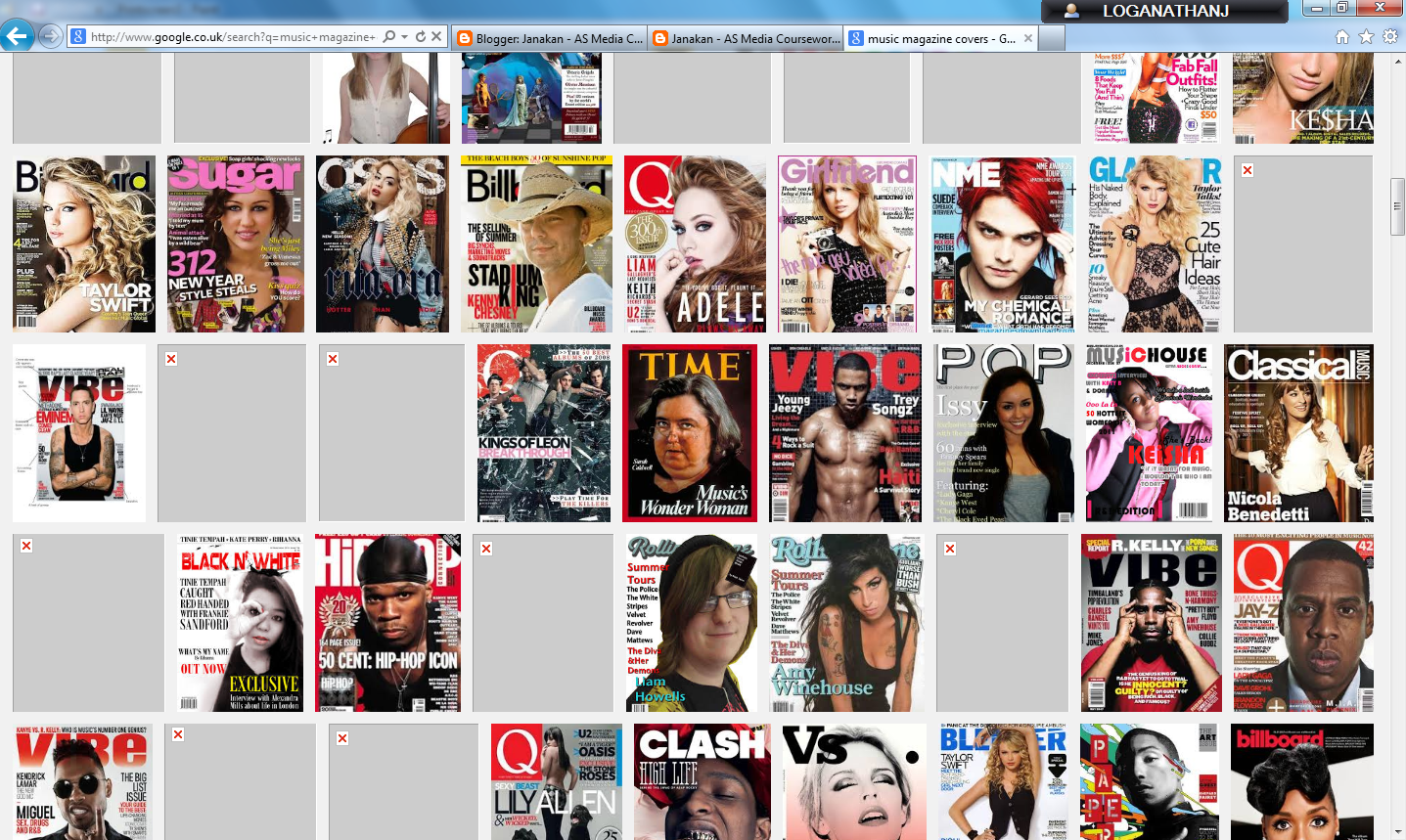 |
| Music Magazine Covers on Google |
 |
| PowerPoint used to put in all the chosen magazines with the details |
Wednesday, 24 September 2014
Subscribe to:
Comments (Atom)